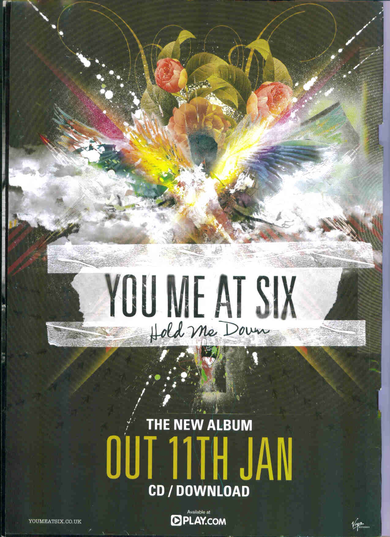

Posters:
I researched some existing album covers and posters to gather research and ideas for my own ancillary texts. I found that the indie / alternative genre as a whole shows a similar design of album cover and poster. Sometimes there are simple designs, with only an image or text to show for the cover, where as often there is the artist used or an abstract picture along with suitable text to show the audience who and what they are showing. Looking at existing work gave me inspiration for my own ancillary texts, displaying the ideal style and design for the genre. I also discovered the conventional form of texts, i.e. the type of information that would appear on a poster and what is more likely to be eye catching, making a reader take interest in the artist. I think a still shot for the poster of the artist works effectively as well as placing the album artwork larger on a poster. I also think it's appropriate to stick with one text font and colour, as well as using the artists logo as an extra feature to show recognition to the fans and audience.


No comments:
Post a Comment