Tuesday, 19 November 2013

Test Shots - No Music Included

I started test shots at the weekend, using my sister as a subject for the videos. Getting a feel of the camera and how to position the camera on the subjects.


I started filming test shots using my sister as the subject within each video. I used an area of fields and roads around my village to film the shots and test out different camera movements and angles. I didn't include the music with the set of shots, focusing on showing different ideas to convey my music video. It also highlighted why using areas with minimal noise is important as the camera picks up a lot of sound. 


I filmed different ideas for my final music video, trying to convey a similar effect and location to what I am going to use. Test shots are a good way to get used to the camera and how it works. I found the temporary location used worked well for my video ideas and when I start filming, I will be able to use the location to the best advantage knowing it is an effective setting. 


I learnt a lot from each shot, including taking into consideration of the weather conditions and environment. My main focus was concentrating on building skills when using the camera, learning the correct positions and features that work best when producing a video. The mise-en-scene included in the shots wasn't something I focused on getting right at this point in planning. 


I used different locations which gave me more opportunities when using the props already at the location, including trees, branches and leaves. This gave me new ideas and added a natural setting towards the videos, a feature that my main music video has a strong link to. 


Setting the scene for a narrative is a typical convention for many existing music videos, creating an environment for the audience to recognize. A location used within the video is shown usually at the beginning of the video, setting the scene for the narrative and music video. The shot is typically high angle, looking down and over a city/landscape or a pan of a key feature at the location.


Another feature of music videos sees the camera moving rather than the main character. I found this technique quite tricky to make effective because the camera would often shake or dip to low or high, ruining the full track circling the character. To improve the shot I would use a tripod and even think of setting up a trolley for the camera to smoothly pan around the character, leading to a successful and effective shot. 

Thursday, 14 November 2013

Animatic Process


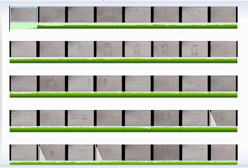
The first step to creating an animatic includes uploading each drawing from the storyboard. To do this, I went to 'home' then 'upload videos and photos', there is a pop up window which then asks for the selection of photos. Once the order has been sorted out the clips play one after another.


The timings was the next part to sort out, creating the right timings that matched with my storyboard. This can be done by clicking the shot wanted to change, then duration and how long it should be shown for.v 


Another feature I used for my animatic was animations and creating cinematography and editing effects within the video. I used fast fades and blurs for some clips highlighted with a clear triangle. 


Finally the music can be added, shown by the green underneath the clips completing the video. 

Tuesday, 12 November 2013

Animatic


I created a animatic using the drawings from my storyboard to create a 2D video synced along with my song. This shows a first draft within the planning process and how I would like my video to turn out. Some complications with the programme caused the music to be slightly out of sync by a couple of seconds but it became barely noticeable once viewed a few times. 

Monday, 11 November 2013

Storyboard


My completed storyboard as a whole, showing 110 shots with drawing and elements included in that scene, with sound and timings, mise-en-scene, editing and cinematography. 

Saturday, 9 November 2013

Ancillary Text Ideas

A promotion package for the release of an album, to include a music promo video, together with two of the following three options: 

- a cover for its release as part of a digipak (CD/DVD package)

- a magazine advertisement for the digipak (CD/DVD package) 


CD Cover Inspiration:


Ariana Grande's album cover for Yours Truly, gave me some inspiration for my ancillary text CD cover. I think the cover reflects parts of my song and artist, with the vignette of darkness around Ariana, which I could incorporate into my own CD cover. Although the genre for Ariana's album is different from my chosen artist, it still reflects a look I would recreate to portray my own music video in that way. I think having the main artist and album name at the top of the cover works effectively, showing the audience who it is straight away. I also think this album cover shows simplicity with not many main colours used, emphasizing the artist in a light that doesn't overcrowd or smother the photograph. I love this artwork and will consider it for my own.

Another single artwork has inspired ideas for my own was Haim's single Falling, which showed the band moving from a store, almost running. This artwork showed a similar idea from the majority of my own video, where the main character is seen to 'escape' and I could recreate this idea into the artwork. I also like how Haim's artwork is in black and white adding an effective simplicity to the cover. Having the band logo covering the top of the cover in bold gives away the band and single name just by glancing at it, and also having the single in colour and a different font makes it stand out.


The artwork for Lana Del Rey's single Off To The Races, inspires some ideas for my own ancillary text because I like the way the artist is singled out within the image. It draws the attention to the artist and is an effective simple shot. Having the title and artist name in bold, white makes the text stand out and shows the audience who it is. I like the way the artist is wearing a simple costume, with the dress matching the text colour. The background is also a contrast against the white, making the artist stand out even more. With my own music video idea in mind, I think this artwork idea would be good to use. 


The album cover for Bastille's Bad Blood, is an idea I would progress further because it is an effective image, showing connotations of my own music video idea. The image shows a vignette of dark around the road, suggesting it is made to look like a headlight of a car and the person featured within the image is running away from the source. This would be a successful ancillary text image that inspires my own idea because it reflects my video idea strongly. The text is all in white, with the band and album name significantly larger and shown in bold making it stand out. The cover is in the style of a film front with small print credits often seen on a DVD cover with the appropriate logos used in the corners. This is an effective style because it suggests to the audience that the album is presented in a film style and shows a story throughout the different 
songs. 

Friday, 8 November 2013

Conventions of Ancillary Texts - Digipaks (CD/DVD package)

Imagine Dragons - Night Visions Album


The typical conventions of a digipak (CD/DVD package) start with the album artwork on the front and back covers and a CD design. The case for the CD is to protect it. The example I have used is of my chosen band Imagine Dragons', album Night Visions. The front cover artwork includes the main artists' logo, with the album name. The picture used for the artwork is often the artist on the front making it more recognizable to the audience who it is. My example has used an abstract photograph, which will have some relation to the album name/songs chosen for the CD. The back cover is slightly more conventional, with these features seen on the majority of ancillary texts. The track listing is found on the back, along with the record label and publishing logo. A bar code can also be seen for when it's ready to be purchased. Within the small print, executive producers, managers and important members of the artists team are usually listed for the business side of the production. The artwork for the back cover varies from a continuation of the front cover, with a similar background and appropriate images to place text over the top or as seen on my example, a plain colour is used, usually within the chosen colour scheme for the album cover. Finally, the CD design varies from each artist. Some have pictures on, relating to the artwork and colour scheme. My example CD is a similar colour tone to the back cover and has the artist and album name on it. The 

Conventions of Ancillary Texts - Magazine Advertisement (CD/DVD package)

I have found an existing music magazine advert for an album from The Killers, a band that feature in my music genre. The advert shows the album presented in the format of a poster, including the original artwork, band logo/name and the album name. This takes up the majority of the advert, making it recognizable to the target audience and fan base of the band. The added text, 'the brand new album' and 'featuring the single Human' are conventional features on a magazine advert, keeping to what people expect to see from a magazine advert. 


Thursday, 7 November 2013

Existing Artwork From My Chosen Band

 
 File:Imagine Dragons - "On Top of the World".jpg
File:Imagine Dragons - "Hear Me" (Single).jpg File:Night Visions Album Cover.jpeg

These different images of artwork feature in singles and the main album from my chosen band, Imagine Dragons. The style of each of the images are similar, showing a continuity and a strong link for each cover. The text font and placement on the cover are in the same place, using similar colours that blend together well. I will use this as inspiration for my own cover art. 

Wednesday, 6 November 2013

Existing Album Covers and Posters

Album Covers:


 Posters:


I researched some existing album covers and posters to gather research and ideas for my own ancillary texts. I found that the indie / alternative genre as a whole shows a similar design of album cover and poster. Sometimes there are simple designs, with only an image or text to show for the cover, where as often there is the artist used or an abstract picture along with suitable text to show the audience who and what they are showing. Looking at existing work gave me inspiration for my own ancillary texts, displaying the ideal style and design for the genre. I also discovered the conventional form of texts, i.e. the type of information that would appear on a poster and what is more likely to be eye catching, making a reader take interest in the artist. I think a still shot for the poster of the artist works effectively as well as placing the album artwork larger on a poster. I also think it's appropriate to stick with one text font and colour, as well as using the artists logo as an extra feature to show recognition to the fans and audience. 

Tuesday, 5 November 2013

Health and Safety - Audio-Visual Production

Health and safety is the most important part of the filming production especially when going out onto location unsupervised by medics and professionally trained first aiders. It is important to know where the filming/ research will take place and get any permission before hand to use that area. It is also highly important to tell multiple people where this is taking place so in the likely hood anything does go wrong, there are reliable people who know where the emergency is. It is also helpful if everyone within the production team is sensible during filming and takes responsibility when using equipment, filming in areas which could be dangerous and generally acting safely. 

"High standards of health and safety in production can only be achieved and 
maintained by everyone involved in the industry playing their part. This 
means recognising and accepting the different obligations and 
responsibilities that health and safety legislation places upon individuals or 
organisations. 
Under health and safety legislation, the ultimate responsibility for health 
and safety rests with the employers involved and the organisations in 
control of premises and facilities. On a day-to-day basis, the producer has 
overall responsibility for ensuring that appropriate standards of health and 
safety are achieved and maintained throughout the production process. 
The underlying need is for the production company to establish appropriate 
organisational structures that support risk control and place health and 
safety alongside editorial and/or dramatic considerations. There should 
also be good planning, communication, co-operation and co-ordination by 
and between all parties involved throughout a production."


Things to remember: 

- If on location, wear appropriate clothing and set up the filming area safely, taking into consideration of weather conditions and other people. 
- Always tell someone where the filming location is, how long there will be filming for and the transport mode used. 
- Always get permission of the area/costume/transport needed.
- Check nobody in the production team needs any medical attention regularly / day to day basis, and/or has an allergy which could come up any time.
- Don't take unnecessary risks that would put someone in danger. 
- Make a filming schedule and risk assessment, keeping everyone informed of what is going on. 


Saturday, 2 November 2013

Media Theorists Continued

Hypodermic Needle Theory:

 The Hypodermic Needle theory is a model of communications suggesting that an intended message is directly received and wholly accepted by the receiver. The model was suggested in the 1930's and is largely considered obsolete today.The theory suggests the media 'inject' information and ideas into the viewers heads, interpreting their own opinions on a subject or person. This theory is often supported by controversial newspaper headlines and rumours documented by magazines as audiences view each subject, they form an opinion on that subject whether it is true or false. 

This theory can link to my work by showing an audience an idea through the narrative of my music video, interpreting it in a way that gives off a certain message for the audience. This can be shown through the mise-en-scene and setting of the video, creating a tone and certain atmosphere to convey the lyrics and music genre. The choice of costumes and make up presents a character strongly, making them recognizable for an audience to see. 
The audience can choose to receive the message portrayed through the video or interrupt it in their own way. This reinforces the theory showing a media text to give out a meaning through a media text and create a reaction from the audience. 

Uses and Gratification Model - Blumer and Katz 1974:

 The Uses and Gratification theory describes the effects of the media from the point of view of the audience. It looks at the motives of the people who use the media and their reactions. The theory generates certain expectations from mass media and shows the gratification of need. People are motivated by a desire to fulfill or gratify certain needs from using the media. The model asks how an audience use the media. 

This theory relates to my work by placing my music video in a position to fulfill an audience's needs from the media. I also have to make sure my video reflects certain expectations and shows the audience what it wants to see. The audience choosing to watch my music video because of the music genre and style of video will support the initial motivation to view my video and show a greater expectation from the viewers. 

There are 4 different needs that make up the uses and gratifications model; surveillance, personal identity, personal relationship and diversion. 

Surveillance is based around the idea that people feel better having the feeling that they know what is going on in the world around them and have an awareness of current issues. This associates to the dominant messages of conforming; dominant ideologies given in media texts such as music videos. 
Surveillance links to my music video by using the mass media to target an audience whilst giving off a message within the form of a media text. Because the audience interrupt each media text to their own ideologies, this creates a difficult purpose my music video to show a correct message and reinforce the ideology of surveillance for awareness of the audience. 

Personal identity explains how being a subject of the media allows an audience to reaffirm the identity and positioning of themselves within society. 
This links to my music video by giving an audience the opportunity to reinforce their personal identity through the music video and support their own position within society by taking on board a media texts message and meaning. 

Personal relationships with the media form relationships between the media and use the media to form relationships with others. For example when a character dies people are sad because they've been watching that character for ages and it feels like they've lost a friend. 
This links to my music video by how the narrative is portrayed and if a protagonist loses or dies, the personal relationship created from the audience with the media is made stronger.